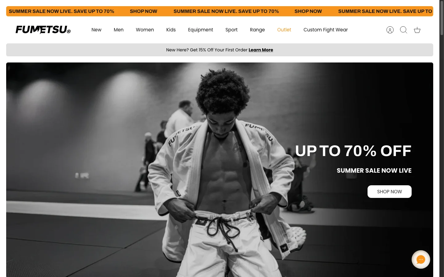
Make it obvious what this is and who it is for.
A shopper should understand the product in about five seconds. Everything above the fold is spent buying that understanding.
What position includes
- A headline that names the product and the job it does
- Who it is for and which problem it solves
- The difference against the obvious alternative
- Imagery showing the product in use, not only on white
- Key callouts such as made in the UK, vegan or independently tested
When position is weak
People do not understand the product quickly enough, so they leave before the rest of the page gets a chance.
Sell the outcome, not the specification.
Customers buy the result a product gives them. Features only matter once they are attached to something the buyer wants.
What persuade includes
- Benefit-led points high on the page
- Use-case imagery in real context
- A short explanation of why the product works
- The product or brand story, where it changes the decision
- Feature-to-benefit blocks rather than a specification dump
When persuade is weak
The shopper understands the product and still feels no reason to buy it today.
Back the claims with evidence.
Proof is what separates a considered brand from a generic listing. If you claim something works, show why anyone should believe it.
What prove includes
- Reviews and rating near the product title
- Customer photography and video
- Before and after, where it is honest
- Expert endorsement or independent testing
- Certifications the category actually recognises
- Comparison against the alternatives a buyer is weighing
When prove is weak
The shopper hesitates, opens a second tab, and buys from whoever answered the question first.
Remove the risk before it becomes a reason to leave.
Even a shopper who wants the product is running a silent list of objections.
What protect includes
- Delivery and dispatch timing near the add-to-cart
- A returns policy written in plain terms
- Warranty and guarantee where they apply
- Sizing guidance, ingredients or what is in the box
- Questions answered on the page, not buried in a help centre
- Visible support and secure checkout reassurance
The questions nobody types into search
- What if it does not fit?
- What if it arrives late?
- What if the quality is poor?
- What if I cannot return it?
When protect is weak
You lose the sale to doubt rather than to a competitor.
Make buying effortless, and make the basket worth more.
Once the shopper is convinced, the page should carry them into the checkout. This is where conversion rate and average order value are engineered.
What push includes
- A persistent add-to-cart on mobile
- Variant selection that does not need explaining
- Clear pricing, and clear savings when there are any
- Bundles, subscriptions and sensible cross-sells
- Payment options presented where they matter
- Real urgency only where it is true
When push is weak
The shopper is convinced and the path to checkout is still doing the arguing.