
Position. Persuade. Prove. Protect. Push.
Product page blueprint
A product page is not a description. If it does not remove uncertainty, build the case and make buying feel safe, traffic arrives and leaves again.
What we have measured or read carefully enough to publish, and the page structures we build against. Nothing here is gated.
Every figure traces to a named source, a date and a measurement period.
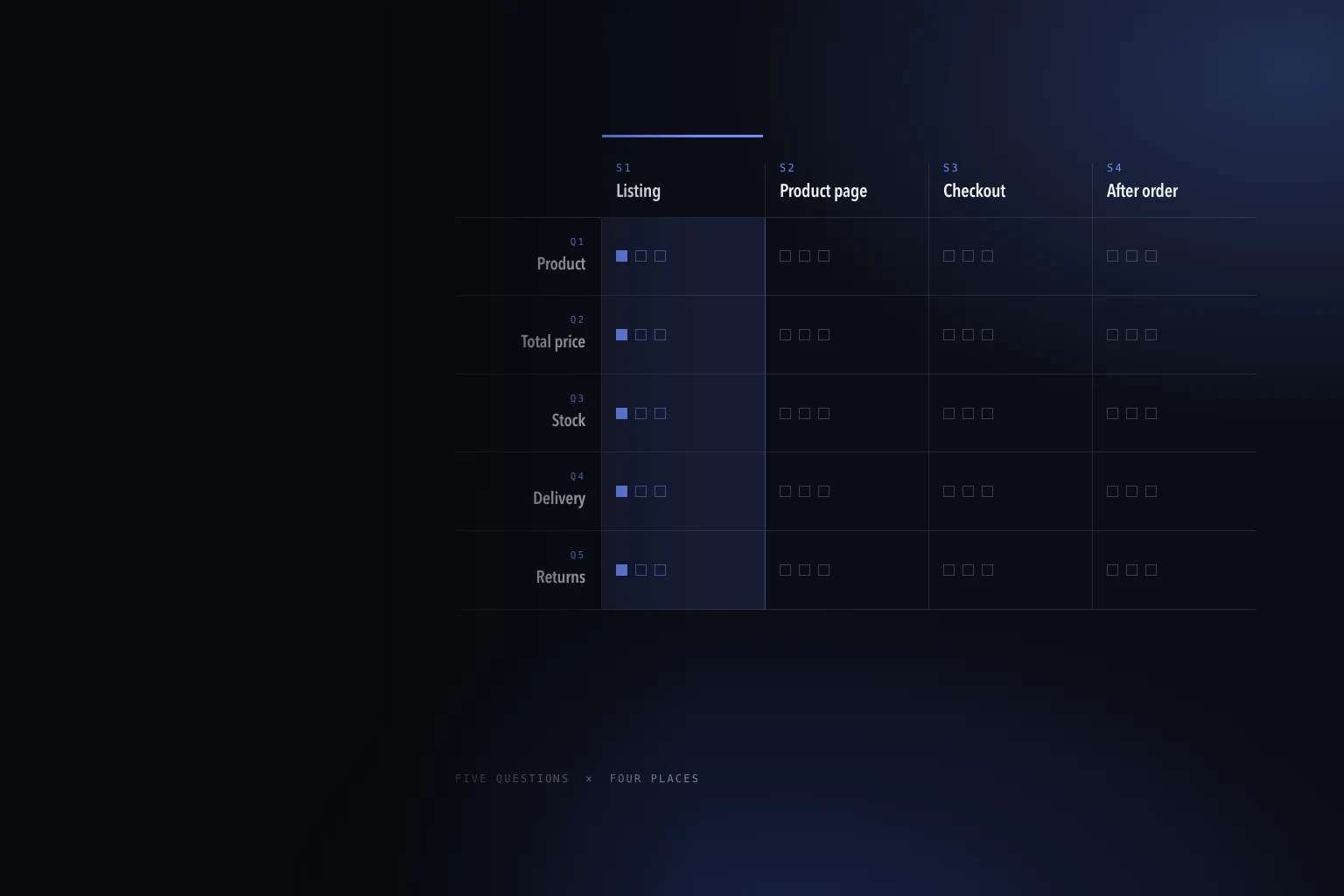
Ecommerce demand is strong. What changed is how people and machines find and judge products. The evidence, and a five-question audit you can run on one product page.
One paper so far. We would rather publish one properly sourced document a year than a monthly opinion with a chart borrowed from somebody else's blog.
Five guides, each covering one page type and the job it has to do before it can look good.
Swipe the guides
Position. Persuade. Prove. Protect. Push.
A product page is not a description. If it does not remove uncertainty, build the case and make buying feel safe, traffic arrives and leaves again.
Target. Guide. Filter. Sell. Rank.
Collection pages are the bridge between search traffic, browsing and a product click. They have to satisfy a search engine and an impatient shopper at the same time.
Hook. Explain. Prove. Direct. Build Desire.
A homepage does not need to sell the whole range. It needs to make a visitor feel they have found the right brand, then send them into the right journey.
Match. Sell. Prove. Remove Risk. Close.
Landing pages are about continuity, clarity, proof and closing. Paid traffic sent to a general page pays for the click and wastes the intent.
The five sit inside one system. Conversion architecture explains how they fit together and which one to fix first.
If one of these has already told you what your store is doing wrong, send the page and the constraint. We will tell you what fixing it involves before anyone talks about a project.