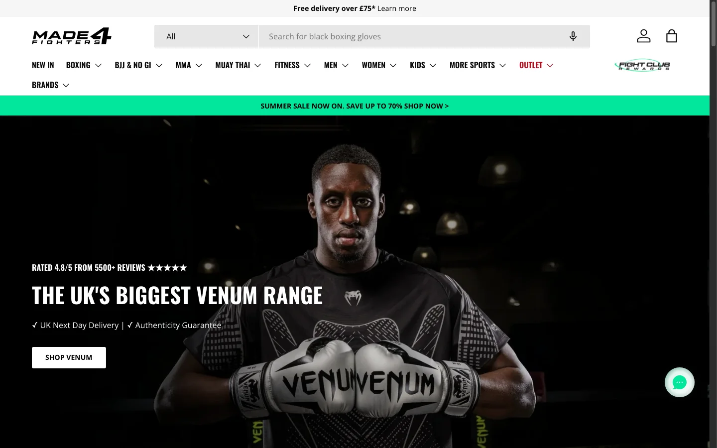
Make the page instantly relevant to shoppers and to search.
This is where organic performance starts. The page should say what it is, what it contains and why it exists.
What target includes
- A clean, specific H1
- Category naming a customer would actually use
- A short introduction at the top, not an essay
- Title and description written for the page, not templated
- Internal linking that connects related collections
Names that work, names that do not
- Boxing gloves
- Under-desk treadmills
- Grain-free dog treats
- Not: shop, all products, trending picks
When target is weak
Search engines cannot tell what the page is for, and shoppers arriving from search do not trust it either.
Help people orient themselves before they start scrolling.
Once someone lands, they need structure. Structure is how a store signals that it knows its own range.
What guide includes
- A short delivery, returns and guarantee bar above the grid
- Sub-collection links as tiles or buttons
- Sorting that reflects how the category is actually shopped
- A best-sellers row where the range is wide
- Shop-by-need entry points where the category has clear jobs
When guide is weak
Shoppers scroll a long undifferentiated grid, lose the thread and leave.
Give people control so they can narrow the range quickly.
Filtering is one of the strongest conversion levers in ecommerce. Past a handful of products it is not optional.
What filter includes
- Filter groups that match how the category is chosen: size, colour, material, use
- Tagging maintained properly, so the filters return what they promise
- A filter interface that works on a phone
- Stacked filters, and a visible way to clear them
- Consistent option naming across the catalogue
When filter is weak
When filtering is poor, people stop browsing rather than work harder.
Make product cards do more than list products.
The grid is where the shopper decides what to click. A card should pre-sell the product before the product page loads.
What sell includes
- Short, readable titles rather than three-line catalogue names
- Consistent image treatment across the grid
- A useful second image on hover: detail or alternate angle
- Rating under the title where reviews exist
- Clear price and honest sale logic
- Colour swatches and meaningful badges only
When sell is weak
The grid reads like a spreadsheet instead of a merchandised store.
Add depth for search without spoiling the shopping experience.
Most stores either publish nothing or drop an essay above the grid. Both cost money.
What rank includes
- Substantial content placed below the grid
- Internal links to sub-collections, best sellers and related guides
- Questions answered from real search intent
- Structured data for those questions
- Content maintained as the range changes, not written once
When rank is weak
Organic traffic never compounds, so the category depends on paid traffic that stops the day the budget does.